
This case study reflects my design work and views. To honor active NDAs, customer names, code, telemetry volumes, and industrial algorithms have been anonymized or generalized. The analysis and diagrams are for portfolio purposes and do not represent Aris Machina’s official position, roadmap, or IP.
Designing an AI operating system for complex manufacturing
Designing an AI operating system for complex manufacturing
Timeline
3 months
Role
First dedicated Product/UX Engineer
Team
Aris Machina
Claude Code, Github, Figma, Miro
BACKGROUND
Aris Machina was building an agentic operating system for industrial manufacturing. As founding Product/UX Designer, I led UX for Protos, an AI-native R&D simulation workspace, and Gemba, a factory-floor diagnostic tool—and unified design across both products and internal tools ahead of Protos’ general availability launch.
The work centred on two primary workflows:
The Protos Workflow (Upstream R&D)
Data Ingestion (Data Studio): Scientists upload experimental data or connect live test stands.
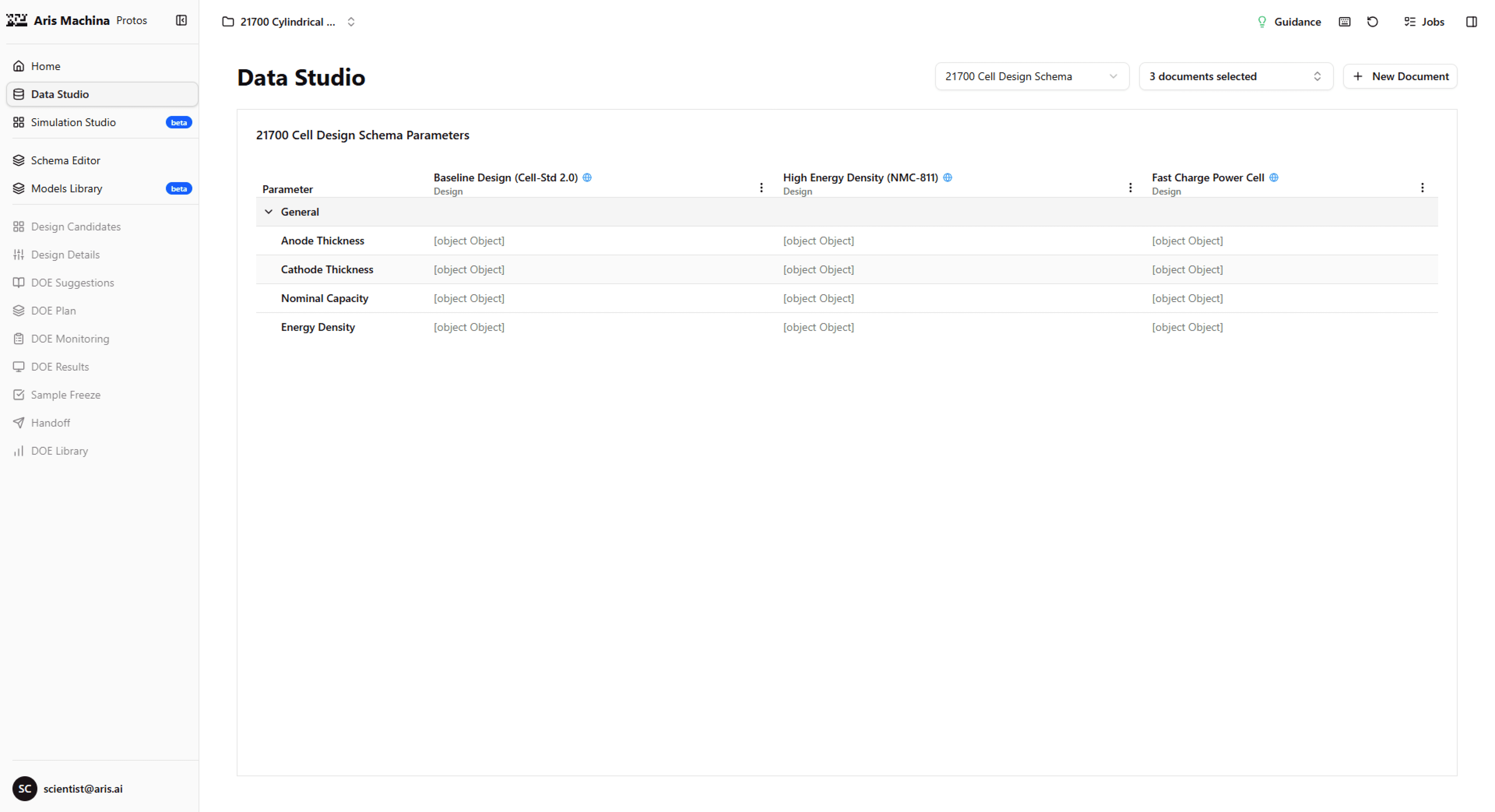
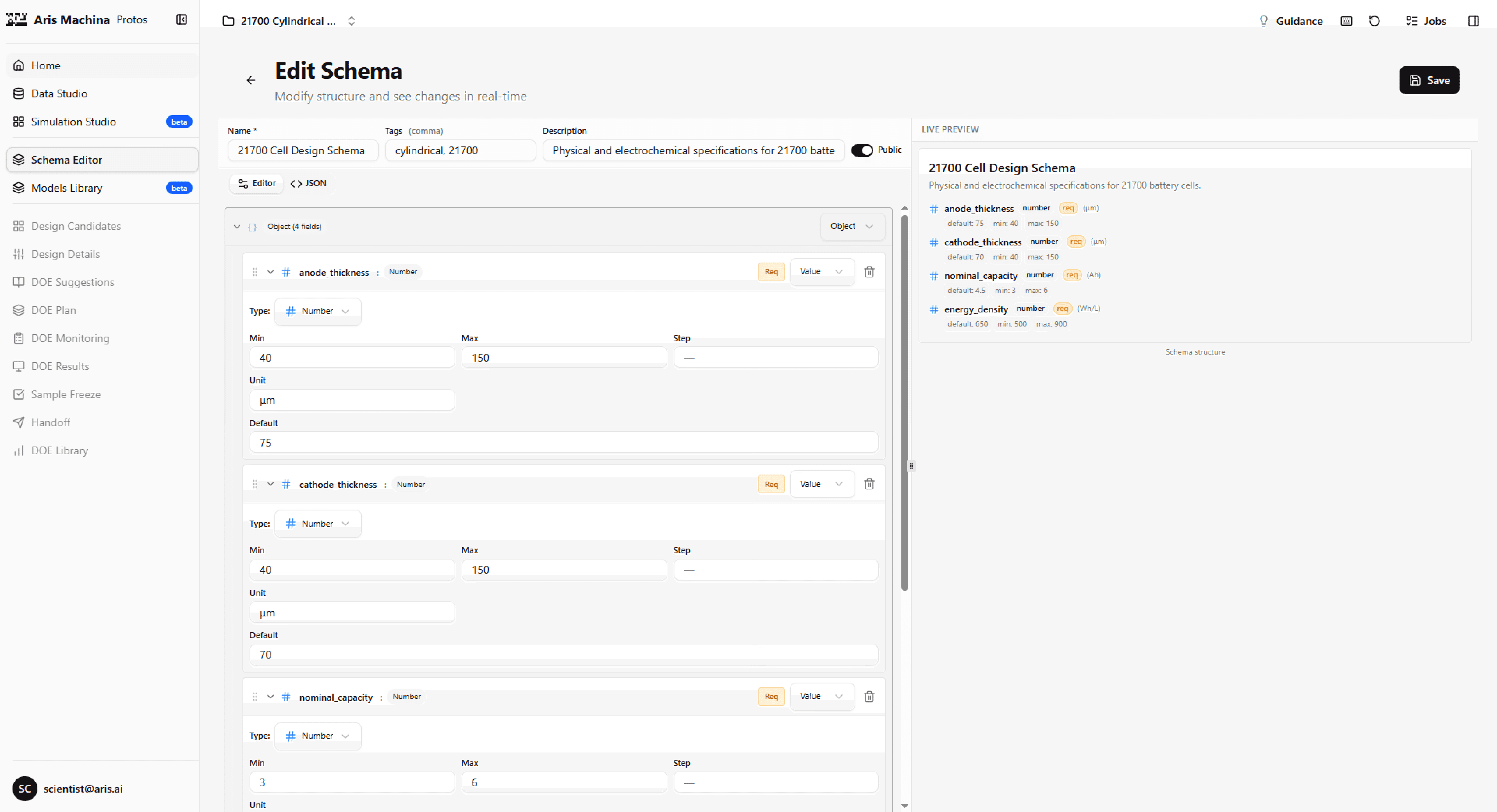
Schema Structuring (Schema Editor): Imported values become reusable parameter templates.
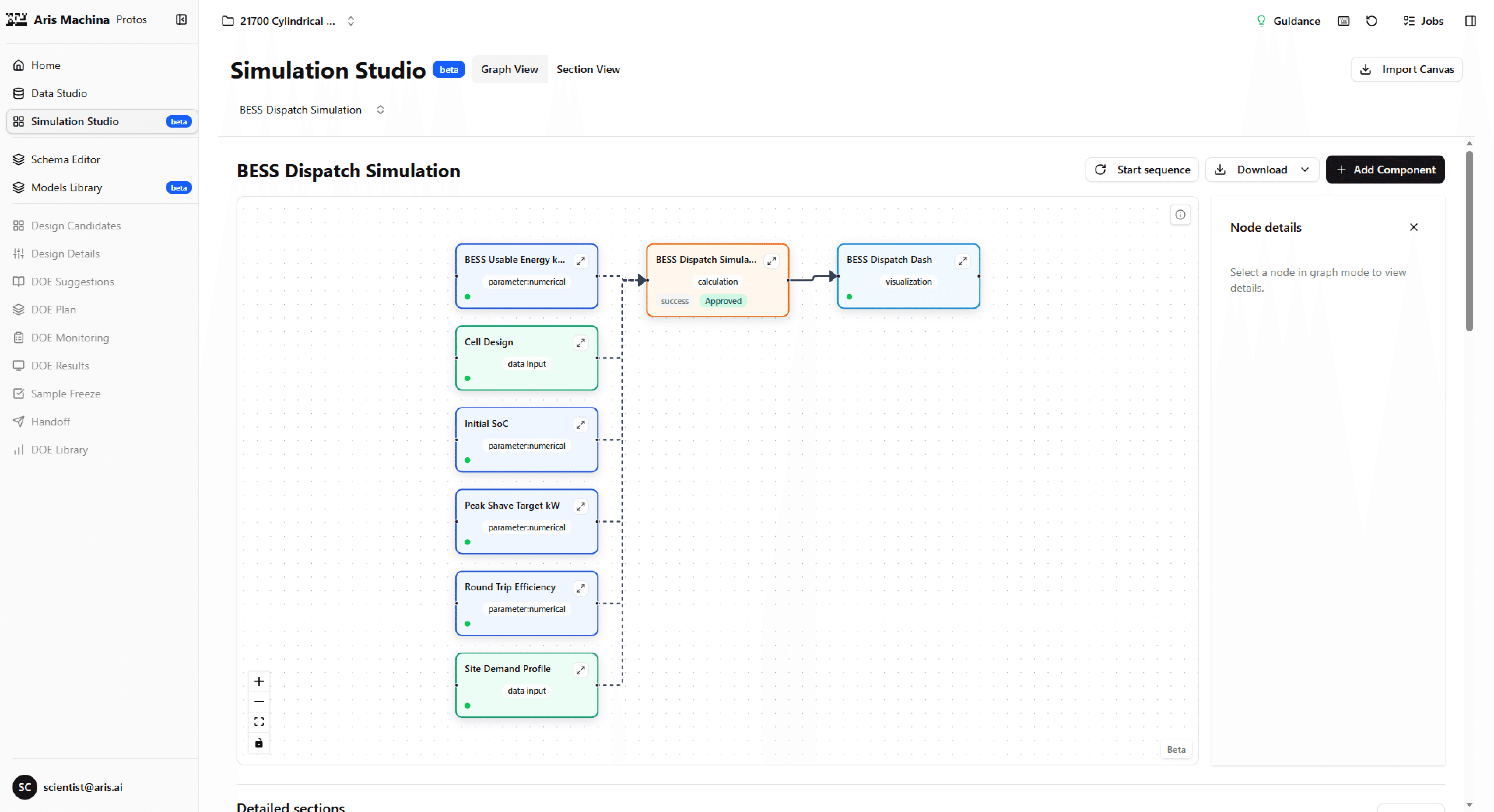
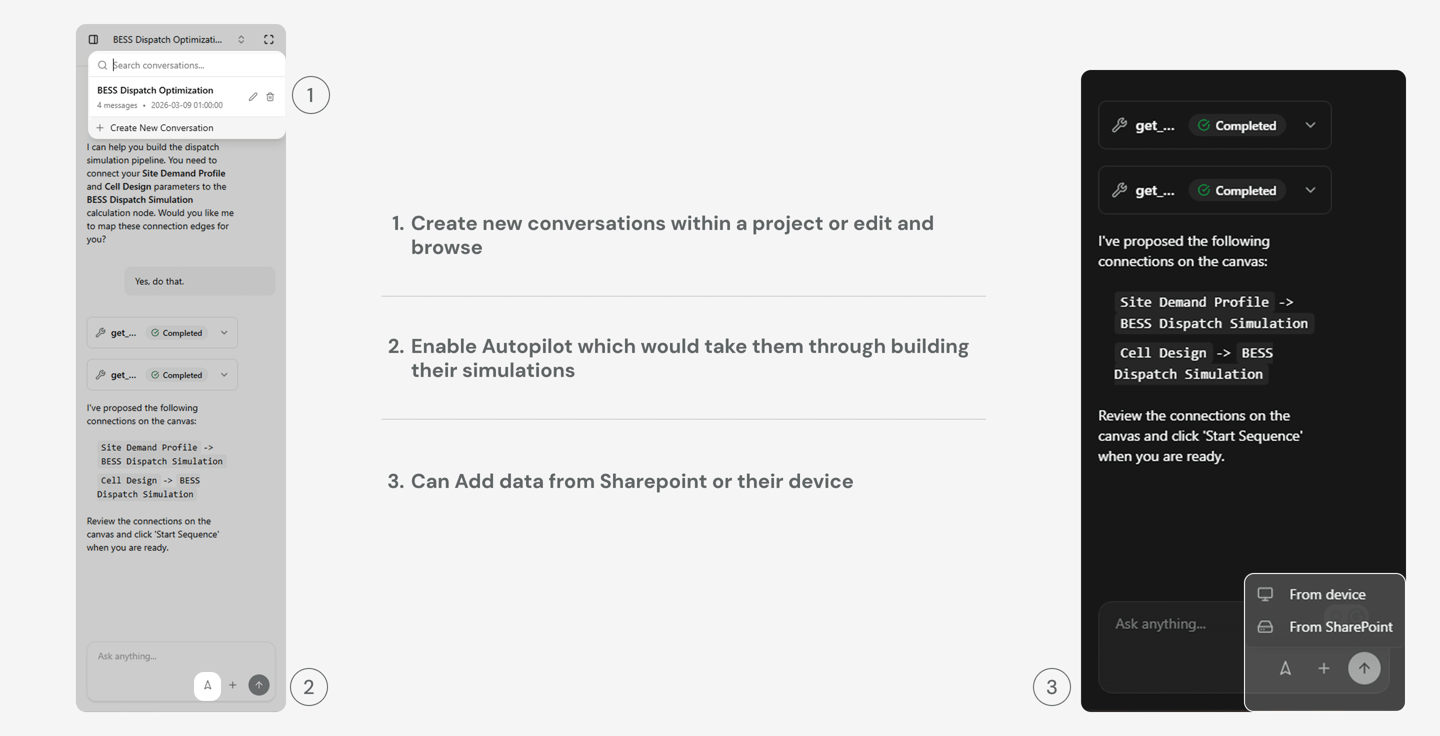
Pipeline Construction (Simulation Studio Canvas): Scientists or engineers connect schemas, calculations, and physics solvers on a node canvas. and teams compare simulation run results across material and design variants.
In Simulation studio they can see the results of the simulation at the end of the page.
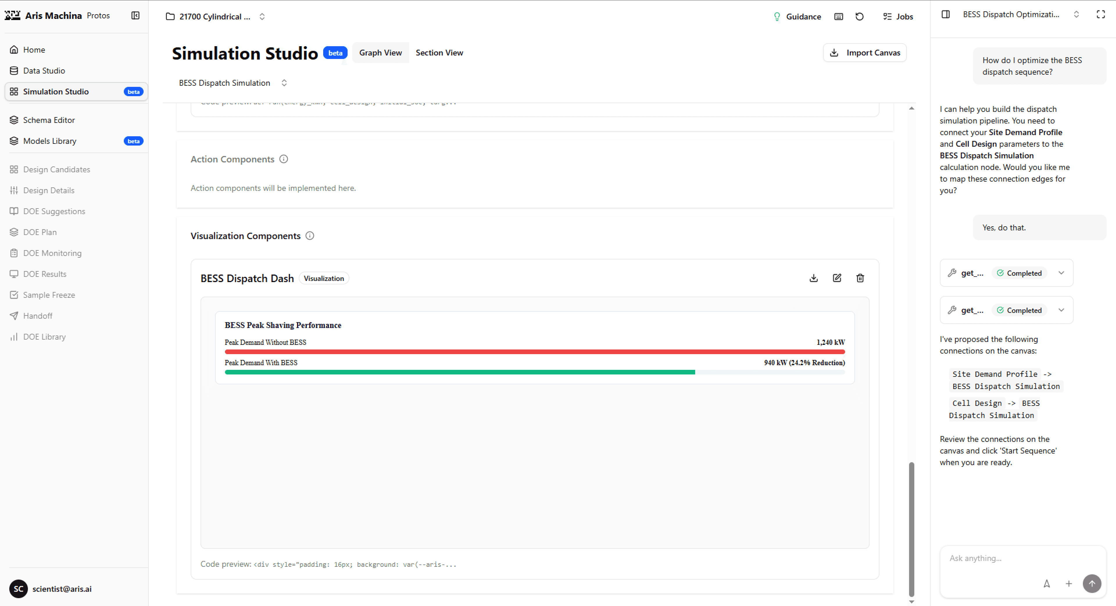
Autopilot Execution: Scientists configure and run simulation sequences, with Copilot support.
The Gemba Workflow (Downstream Manufacturing Troubleshooting)
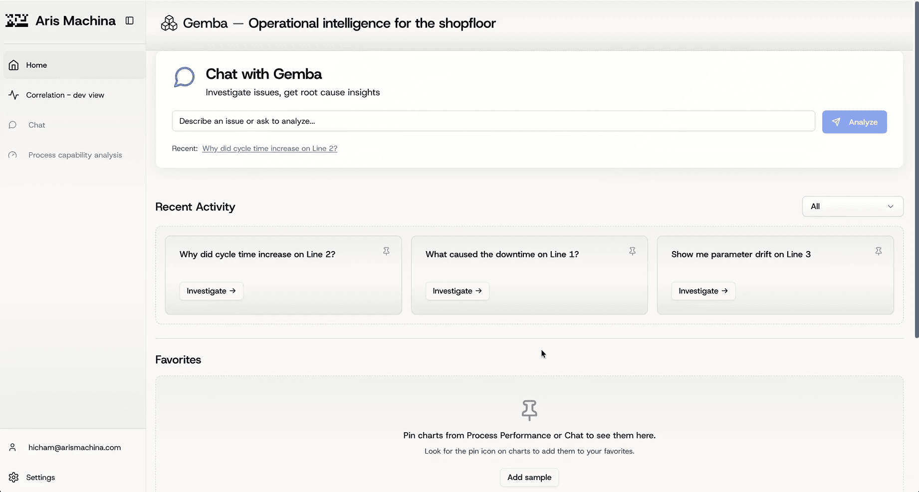
Gemba is the shopfloor operational intelligence platform designed for factory operators, automation engineers, and process engineers.
It provides:
Correlation Finder: A tool that enables shopfloor teams to correlate raw sensor-tag telemetry (such as temperature, pressure, or cycle times) with production targets (such as cell-weight defects or yield rates) to diagnose anomalies.
App Studio: A no-code dashboard builder that allows plant managers to quickly spin up custom diagnostic views and pilot dashboards without engineering bandwidth.
Operational Intelligence: Moving diagnostics from "inside-out" engineering metrics to operator-facing actions, helping resolve machine drift, scrap spikes, and line downtime.
Glossary (For Non-Engineers)
If you are new to hardware engineering or manufacturing, here is how to translate the key concepts in this case study:
Upstream R&D / Simulation: Digitally testing virtual designs (like crash-testing a car on a computer screen) to see how they will perform in the real world before spending money building physical prototypes.
Data Lineage & Provenance: The “birth certificate” of data. It shows exactly where a number came from (e.g., did a user type it, was it uploaded from a spreadsheet, or did an AI model calculate it?).
Correlation Finder: A search tool that looks at machine data to figure out why something broke (like diagnostic software for a car engine)
PROBLEM
Protos (Upstream R&D)
The Problem: The Battery Bias. Protos possessed a domain-agnostic backend, but its front-end UX was locked into a battery-manufacturing costume because the default templates relied on Northvolt data.
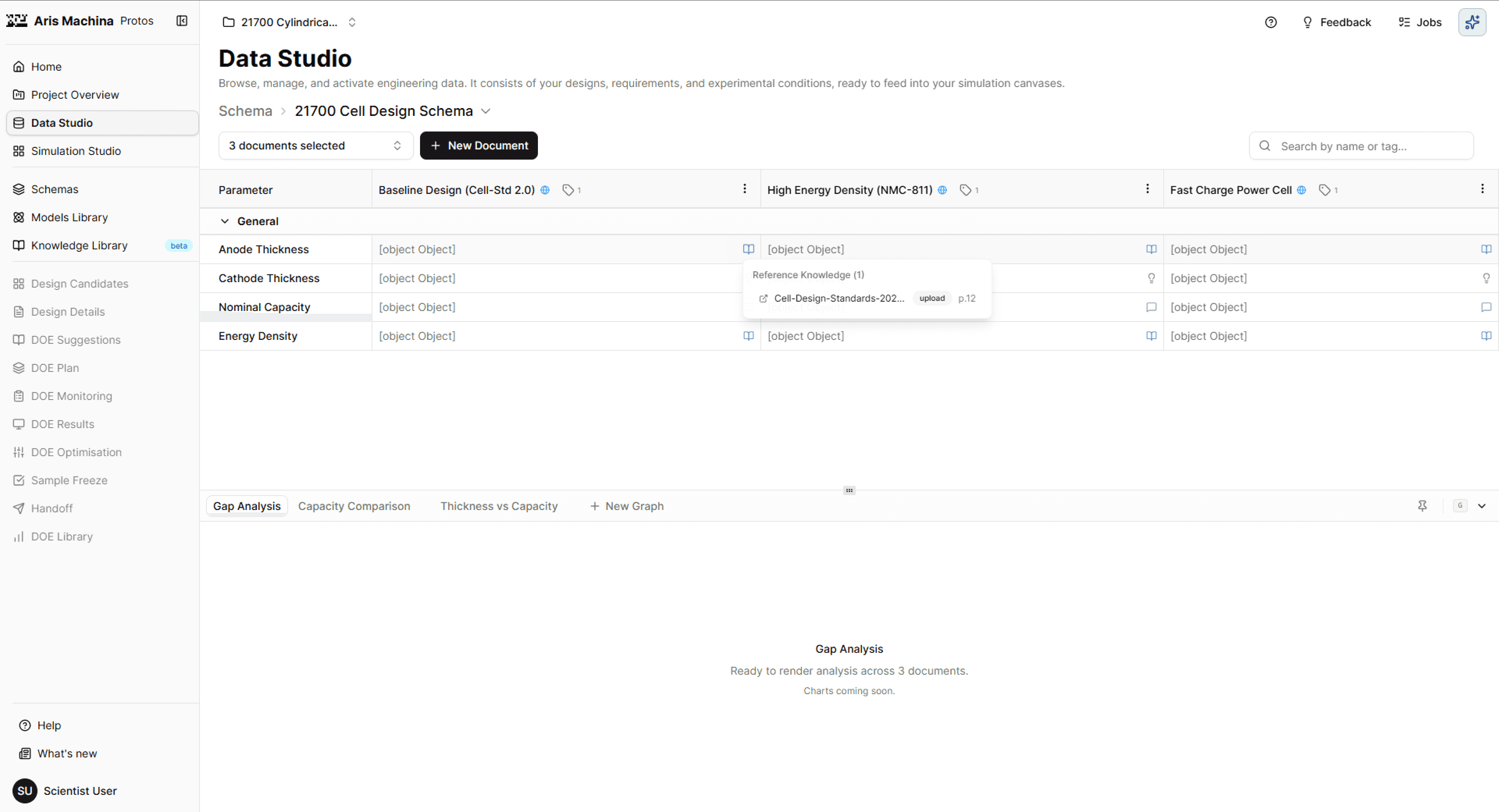
The Friction: Empty states featured battery diagrams, onboarding templates focused exclusively on battery design, and internal URL paths leaked battery-specific tags (e.g.,
cell_std).The Impact: Prospects in semiconductors, die-casting, and materials concluded the platform was \"not for them\" and bounced during early walkthroughs.
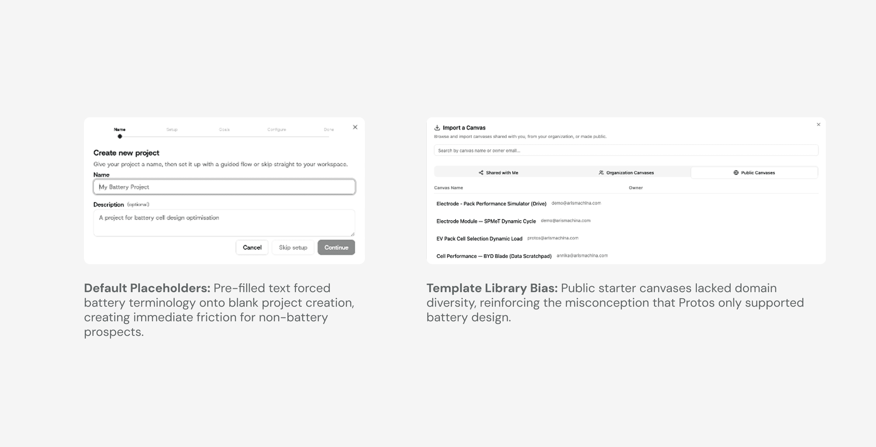
The 14-Step Onboarding Friction Loop: Setting up a first project required a grueling 14-step form (inviting team members, configuring naming conventions, selecting default metric units, etc.) before a scientist ever saw their first piece of data.
Blind Onboarding Funnels (Telemetry Scarcity): The product fired only six basic Mixpanel tracking events total. None of these events tracked activation milestones, leaving the team blind to where new users dropped off in the onboarding funnel.
Accessibility Failures in Dark Mode: Inverted colours broke contrast, focus states, and translucent overlays.
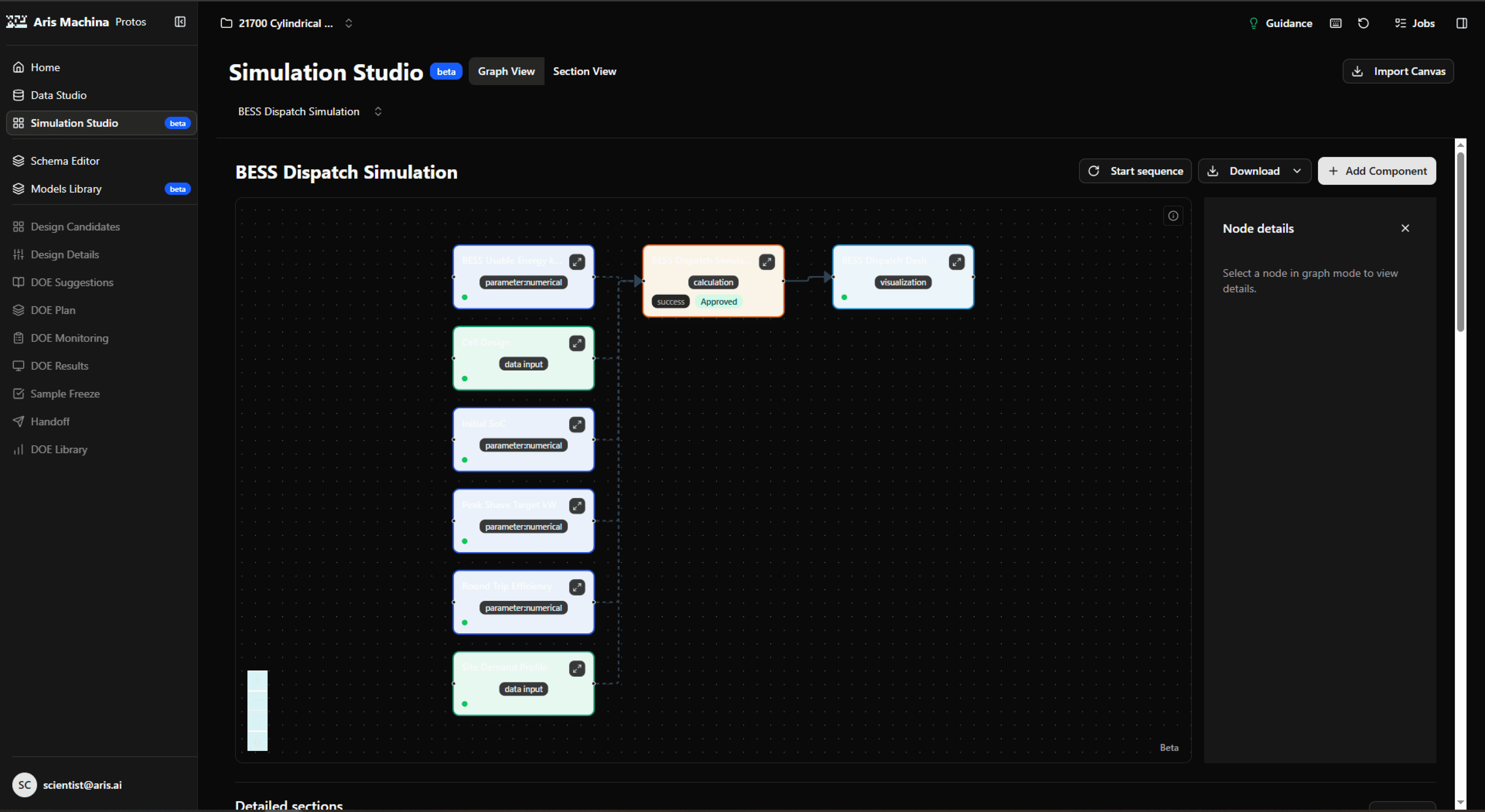
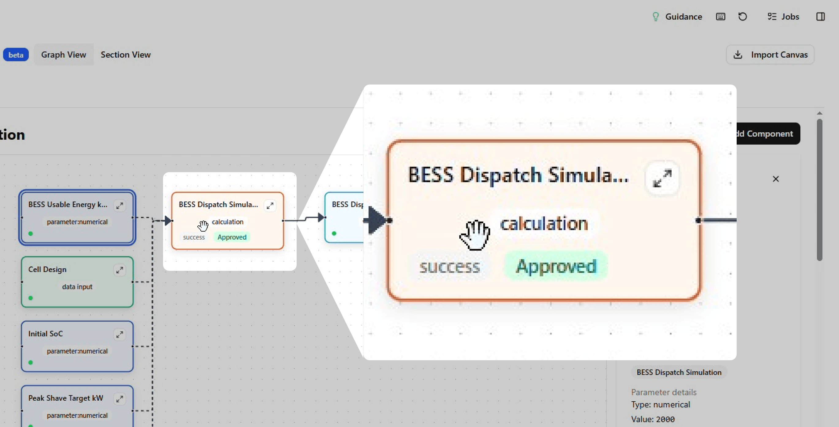
Grab Targets Eating Card Clicks: Dragging handles blocks card clicks, resulting in dead clicks and unclear dependency guidance. - Usability: Draggable canvas node cards displayed a grab cursor and did not respond to card clicks. Mixpanel registered 152 dead clicks on card bodies because configuration options were hidden behind a tiny ↗ expand icon. In addition, disabled sequence triggers showed HTML tooltips that explained only two of four missing dependencies, offering no actionable path forward.
Gemba (Downstream Manufacturing)
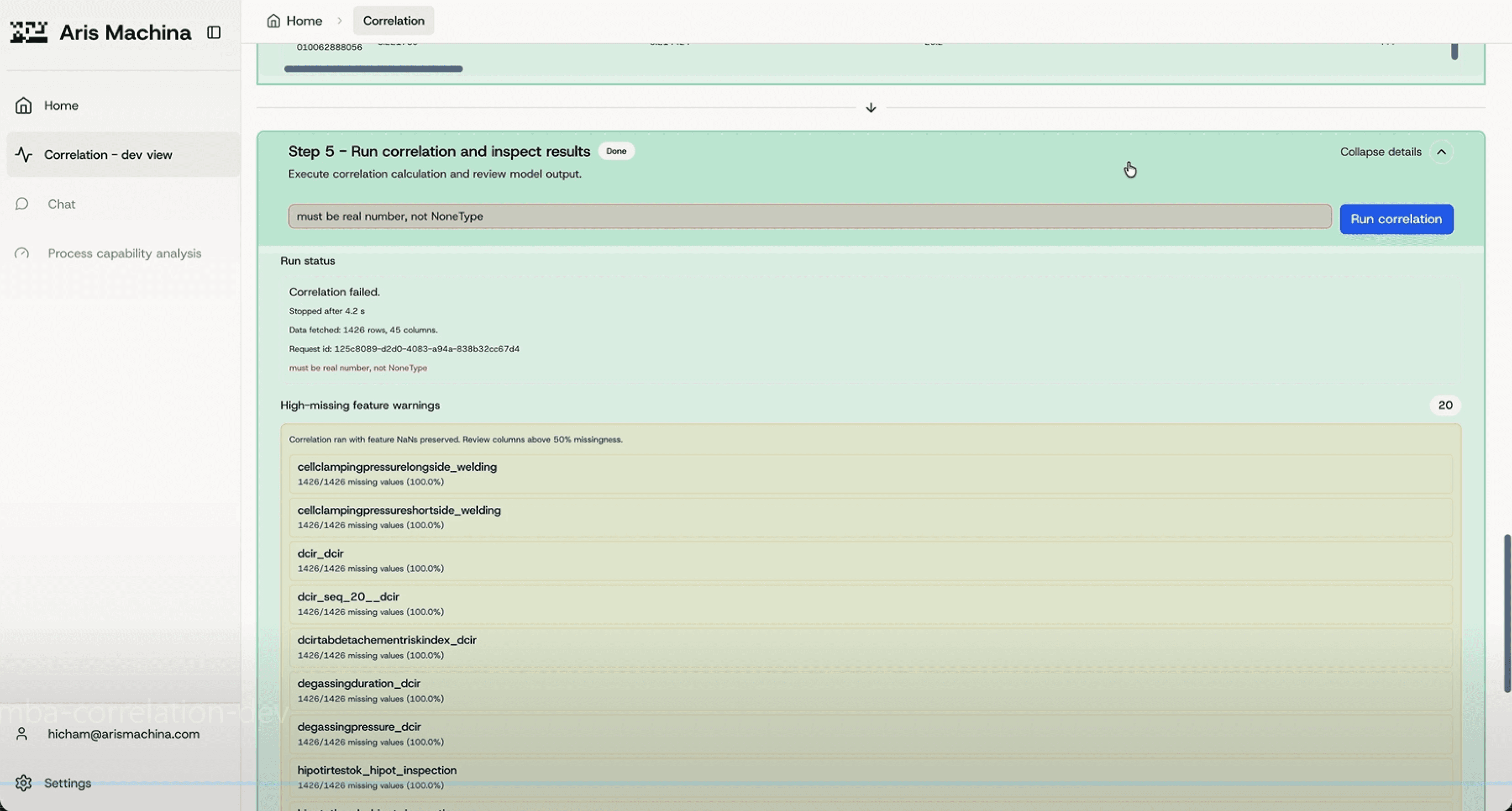
Raw Backend Engine with No Usable Interface: The core correlation engine output raw statistical coefficients (r-values) rather than actionable insights. Without a front-end UI or plain-language summary, the tool was completely inaccessible to non-technical factory operators troubleshooting machinery under time pressure.
Strategic Misalignment & "Inside-Out" Engineering: The product team lacked a validated user roadmap, resulting in an "inside-out" development cycle. Engineering bandwidth was consistently wasted on building features optimised for database ergonomics rather than resolving actual shopfloor operator workflows.
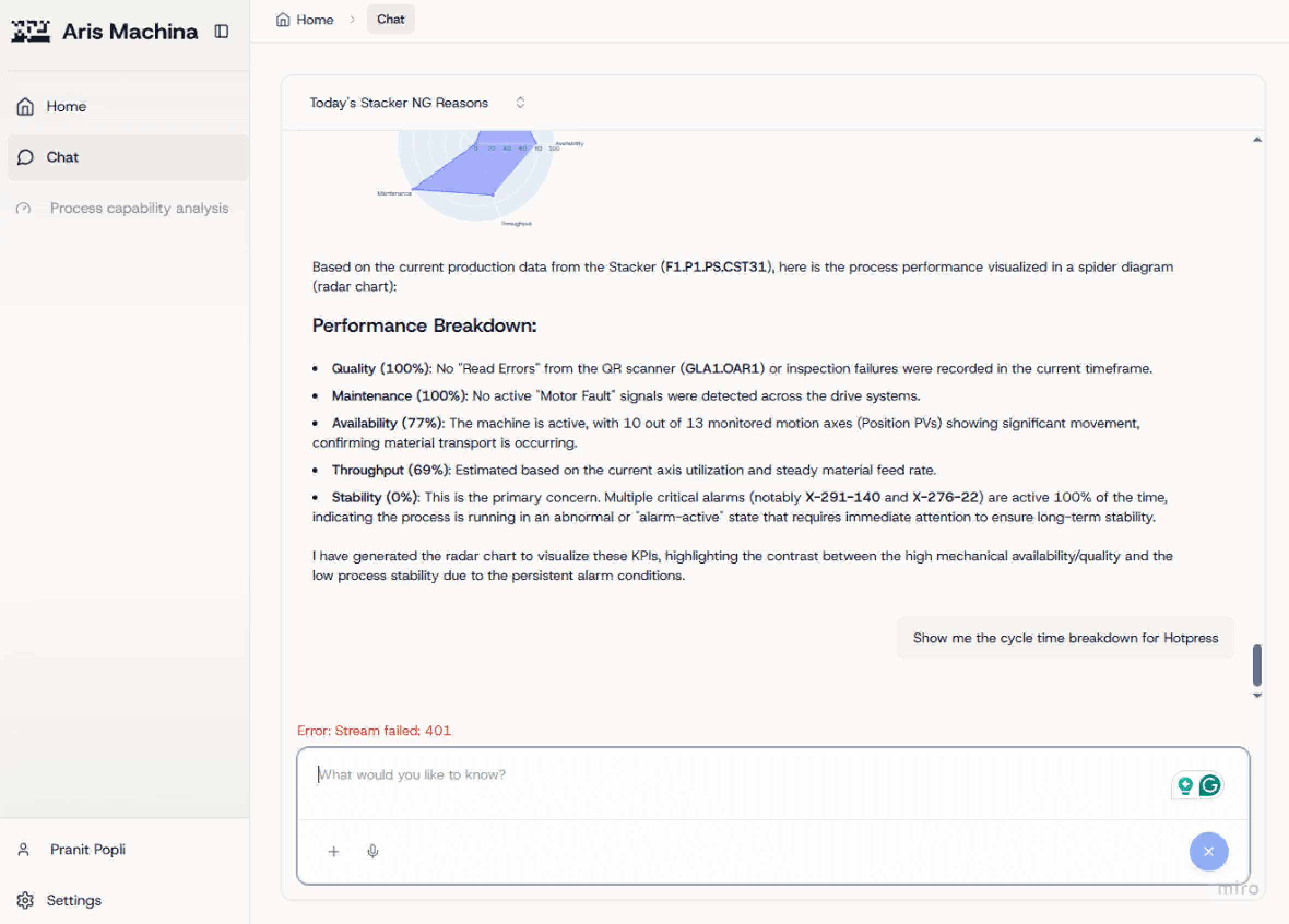
Unscoped AI: Queries lacked physical hardware scoping (Plant → Machine), and the system failed to tailor outputs to specific personas (e.g., giving both automation and ops teams the same unstructured text).
Platform (Shared Infrastructure & Design System)
Visual Fragmentation & Theme Drift: The lack of a centralised style dictionary across Protos and Gemba forced developers to write custom CSS overrides. This stripped visual control from design, destroyed UI consistency, and made global brand updates impossible.
Broken Handoff Pipeline: Misconfigured, outdated design system dependencies crashed application builds upon import. To bypass this, engineers resorted to copy-pasting UI component code directly into local files, creating massive technical debt and drift and stalling feature shipments.
PROBLEM
Protos (Upstream R&D)
The Problem: The Battery Bias. Protos possessed a domain-agnostic backend, but its front-end UX was locked into a battery-manufacturing costume because the default templates relied on Northvolt data.
The Friction: Empty states featured battery diagrams, onboarding templates focused exclusively on battery design, and internal URL paths leaked battery-specific tags (e.g.,
cell_std).The Impact: Prospects in semiconductors, die-casting, and materials concluded the platform was \"not for them\" and bounced during early walkthroughs.
The 14-Step Onboarding Friction Loop: Setting up a first project required a grueling 14-step form (inviting team members, configuring naming conventions, selecting default metric units, etc.) before a scientist ever saw their first piece of data.
Blind Onboarding Funnels (Telemetry Scarcity): The product fired only six basic Mixpanel tracking events total. None of these events tracked activation milestones, leaving the team blind to where new users dropped off in the onboarding funnel.
Accessibility Failures in Dark Mode: Inverted colours broke contrast, focus states, and translucent overlays.
Grab Targets Eating Card Clicks: Dragging handles blocks card clicks, resulting in dead clicks and unclear dependency guidance. - Usability: Draggable canvas node cards displayed a grab cursor and did not respond to card clicks. Mixpanel registered 152 dead clicks on card bodies because configuration options were hidden behind a tiny ↗ expand icon. In addition, disabled sequence triggers showed HTML tooltips that explained only two of four missing dependencies, offering no actionable path forward.
Gemba (Downstream Manufacturing)
Raw Backend Engine with No Usable Interface: The core correlation engine output raw statistical coefficients (r-values) rather than actionable insights. Without a front-end UI or plain-language summary, the tool was completely inaccessible to non-technical factory operators troubleshooting machinery under time pressure.
Strategic Misalignment & "Inside-Out" Engineering: The product team lacked a validated user roadmap, resulting in an "inside-out" development cycle. Engineering bandwidth was consistently wasted on building features optimised for database ergonomics rather than resolving actual shopfloor operator workflows.
Unscoped AI: Queries lacked physical hardware scoping (Plant → Machine), and the system failed to tailor outputs to specific personas (e.g., giving both automation and ops teams the same unstructured text).
Platform (Shared Infrastructure & Design System)
Visual Fragmentation & Theme Drift: The lack of a centralised style dictionary across Protos and Gemba forced developers to write custom CSS overrides. This stripped visual control from design, destroyed UI consistency, and made global brand updates impossible.
Broken Handoff Pipeline: Misconfigured, outdated design system dependencies crashed application builds upon import. To bypass this, engineers resorted to copy-pasting UI component code directly into local files, creating massive technical debt and drift and stalling feature shipments.
INSIGHTS
Protos
Domain-Neutral UI Expands Markets: Hardcoded industry graphics (like battery icons) alienate other sectors. Keep empty states and templates domain-agnostic so any prospect (pharma, aerospace) sees themselves in the product.
Data Lineage = User Trust: Scientists reject "black box" numbers. The UI must explicitly tag data provenance (user-inputted, file-uploaded, or AI-generated) so experts can verify its origin.
Speak the User's Language: Exposing database jargon (such as "nodes" or "cell-std") creates cognitive friction. UI copy must match the expert's real-world vocabulary.
Measure Before You Redesign: You can't fix an onboarding funnel blindly. Instrument analytics first so design pivots are driven by hard data, not guesswork.
Gemba
Clarity Beats Complexity Under Stress: Complex node graphs paralyse factory operators during machine downtime. Linear, sequential troubleshooting maps speed up resolution.
Insights Over Raw Decimals: Raw statistical outputs (e.g., r=0.74) stall factory floor decisions. Grouping data into actionable buckets (High/Medium/Low confidence) drives immediate action.
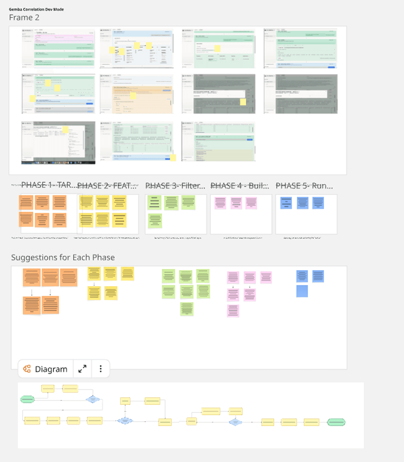
Mapping them and brainstorming helped determine what was needed.
Sticky Context Prevents Errors: Diagnostic data is useless if operators lose track of what machine they’re viewing. Sticky filters anchor the physical context as they scroll.
Workshops Break Engineering Silos: When developers over-index on backend architecture, structured ideation workshops (like Impact/Effort mapping) force the team to realign on user-centric priorities.
Platform
Measure Before You Redesign: You can't fix an onboarding funnel blindly. Instrument analytics first so design pivots are driven by hard data, not guesswork.
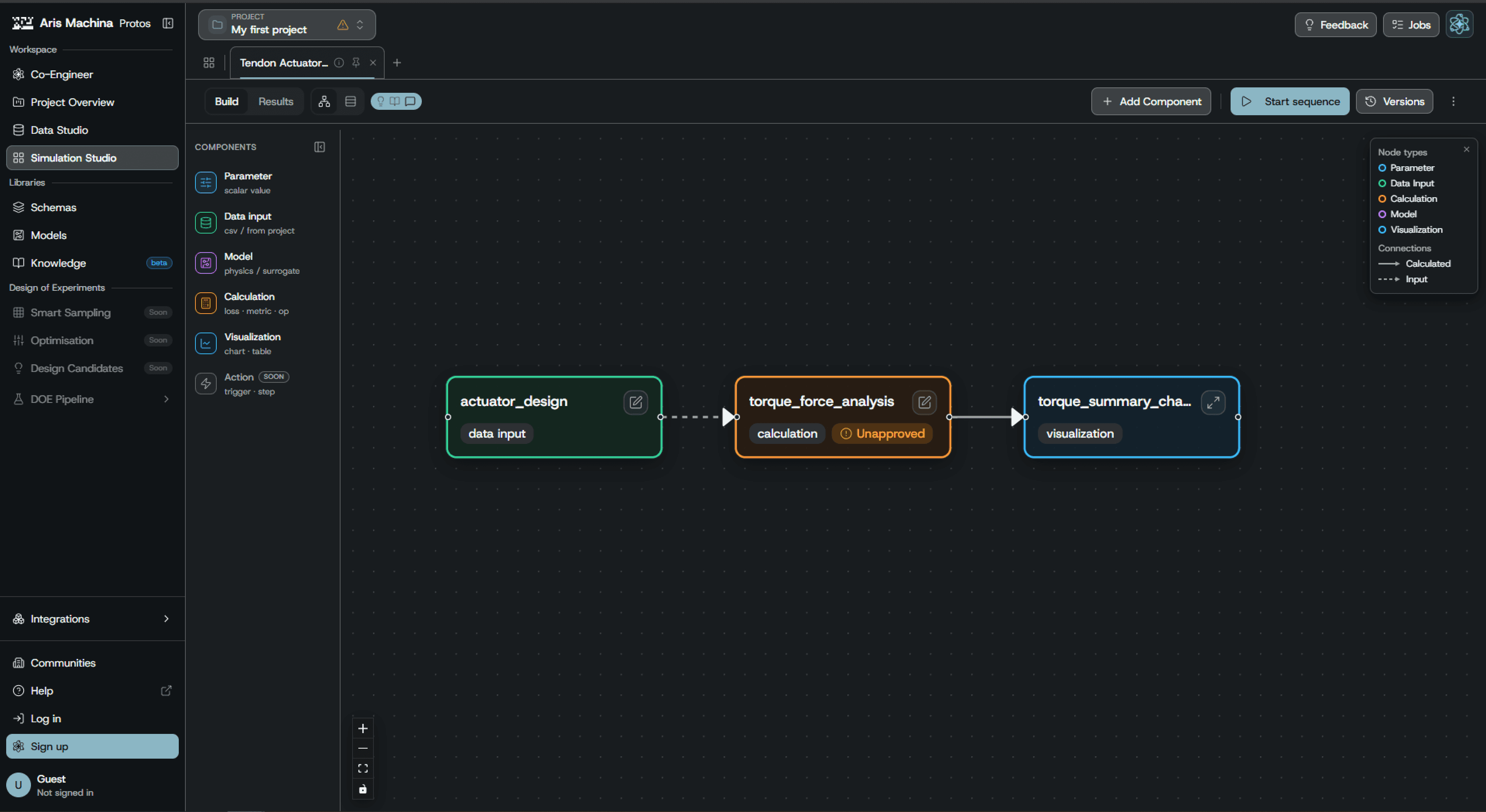
Dark Mode is an Architecture: A simple CSS colour-invert guarantees contrast failures. Dark themes must be built as a dedicated token system to guarantee WCAG accessibility compliance.
SOLUTION
Protos (Upstream R&D)
Domain "De-battery-fication": Executed a 142-item audit to strip all battery-specific jargon and graphics, replacing them with generic schemas to instantly unlock sales demos for semiconductors and metallurgy.
14-to-3 Step Onboarding: Collapsed a gruelling 14-step setup wizard into a frictionless 3-step flow (Name → Schema → Dashboard), deferring complex settings to contextual in-app nudges which nuged into onboarding without
Data Provenance Chips: Designed interactive visual tags (Ingested, User-Entered, AI-Generated, Canvas-Linked) so scientists can instantly verify data origins on hover.
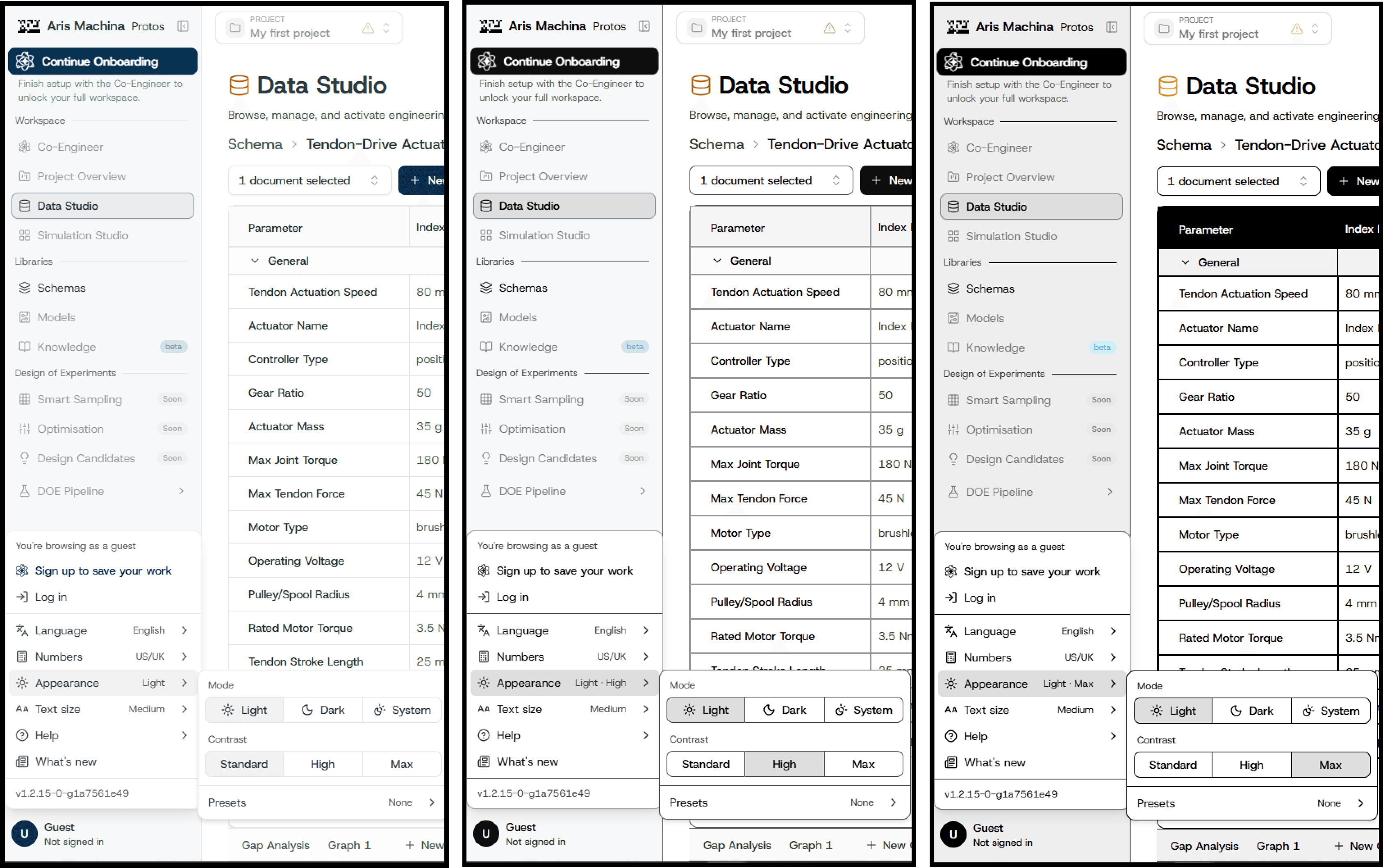
An interactive visual preference drawer allowing users to switch between three custom contrast thresholds to meet WCAG 2.1 AA and AAA readability guidelines:
Low Contrast (Standard): The default brand styling using soft colours, low-stress borders, and balanced branding highlights.
Medium Contrast (Enhanced): High-readability styling that darkens text labels, thickens borders, and adds subtle dropshadows to structural containers for easier navigation.
High Contrast (AAA): An absolute contrast view designed for visually impaired operators, forcing pure black (#000000) and white (#FFFFFF) blocks with thick outlines and active yellow/green highlights.
Created custom dark-mode token values designed specifically for readability on dark layouts. By matching accents and primary highlights to specific OKLCH saturation levels, you resolved all contrast warnings on dark overlays while preserving the brand identity.
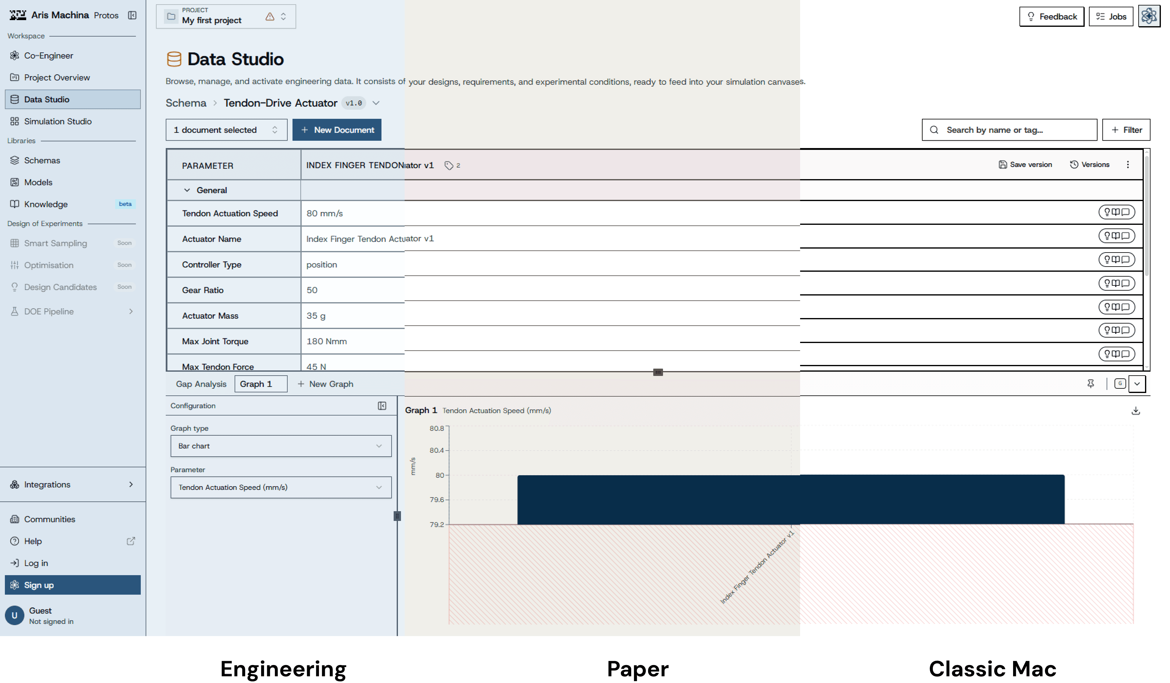
Workflow-Driven UI Themes: Designed three custom visual skins—Engineering (blueprint telemetry), Paper (warm lab notebook), and retro Classic Mac—that go beyond standard dark mode.
Personalisation as Utility: Framed aesthetic customisation as functional delight rather than visual fluff. Allowing scientists to match the UI to their active task (e.g., using the "Paper" theme to reduce glare during long reading sessions) drives daily engagement and emotional resonance.
Activation Telemetry: Shipped a structured Mixpanel blueprint to measure the exact drop-off between account creation and the first successful simulation run.
Gemba (Downstream Manufacturing)
Streamlined Operator Onboarding & AI Experience: Redesigned the onboarding wizard, the grounded AI chat experience, and the inline feedback funnel specifically tailored for factory floor environments.
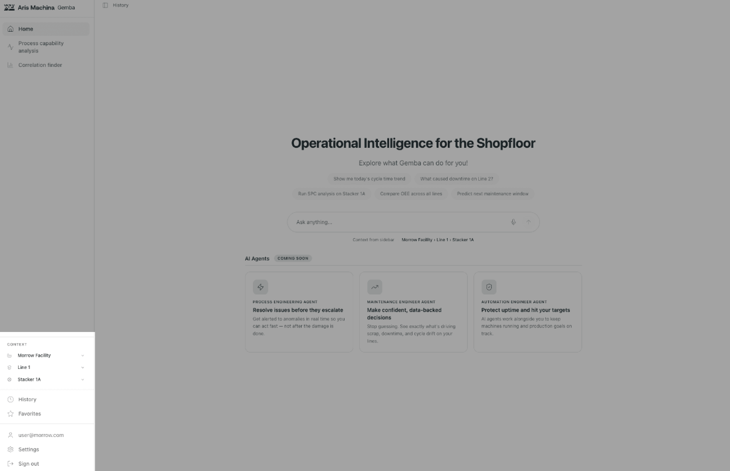
Actionable Correlation Finder: Translated complex backend algorithms into human-readable "Diagnosis Cards" and linear troubleshooting maps, replacing raw statistical coefficients.
Sticky Context Panels: Anchored active machine parameters and asset scopes (Plant → Line → Machine), ensuring operators never lose physical hardware context while analyzing dense telemetry or chatting with AI.
Cross-Functional Ideation: Facilitated structured workshops (Crazy 8s, Impact/Effort mapping) that successfully pivoted the engineering roadmap away from backend architecture toward real operator needs.
Platform
Extraction Over Reinvention: Codified 1,000+ lines of custom CSS into a shareable framework, avoiding from-scratch component delays.
Two-Tier Architecture: Separated universal UI primitives (Tier 1) from complex product patterns like Copilot chat (Tier 2) to prevent system bloat.
OKLCH Token Architecture & Contrast Drawer: Engineered OKLCH dark-mode tokens with an in-app preference drawer toggling between Standard (AA), Enhanced, and High Contrast (AAA) modes.
Activation Telemetry Blueprint: Shipped a Mixpanel tracking system capturing baseline product metrics (73 WAUs, 727 AI chats).
Rapid Scaling: Deployed a unified visual identity across products instantly without slowing down engineering momentum.
Controlled Blast-Radius Refactor: Executed a phased rollout across 7–8 targeted PRs to safely unify design tokens across Protos & Gemba without breaking builds (200+ files).
IMPACT
I established the user experience foundations and design infrastructure that transitioned the platform from a fragmented, niche prototype to a market-ready enterprise ecosystem.
0 Rage Clicks. 3 New Markets. 1 Measurable Funnel..
0% Canvas Rage Clicks: Fixed node affordances to completely eliminate dead clicks (which previously made up 60% of all product errors).
Unlocked 3 New Sectors: Stripped hardcoded battery bias from the UI, unblocking commercial demos for semiconductor, materials, and die-casting.
First-Ever Telemetry: Shipped custom tracking to measure the onboarding funnel and capture baseline product metrics (73 WAUs, 727 AI chats).
6 Dashboards. 100% Parity. 1 Enterprise Pilot.
6 Pilot Dashboards Approved: Cleared the component feasibility checklist to successfully unblock the Magna POC.
100% Demo Parity: Aligned Gemba's UI with Protos design tokens in a single sprint, ensuring a unified visual pitch for the enterprise pilot.
200 Files. 100% Pass Rate. Protected Velocity.
200-File System Scale: Deployed a unified design system that builds reliably across 200 consumer files.
Protected Dev Velocity: Eliminated an unnecessary onboarding persona step to safeguard engineering timelines.
100% Test Pass Rate: Shipped a redesigned flow that flawlessly cleared all automated integration tests.
LEARNINGS
Design Learnings & Iterations
Write a 1-Page Plan First: Instead of explaining design decisions across 8 separate pull requests, write a simple strategic memo upfront so leadership agrees before coding starts.
Build Dark Mode Right from the Start: Adding dark mode at the end created ugly contrast bugs. Next time, design light and dark colours together from day one.
Double the Time for Code Audits: Cleaning up old CSS took 11 days instead of 5. Always double your estimated time when working with messy legacy code.
Test Rough Wireframes Sooner: Don't wait 6 weeks to show designs to users. Test rough, low-fidelity prototypes early to catch flaws before engineering starts building.
Launch Big Redesigns All at Once: Releasing new UI features piece-by-piece confused factory operators. Major UX changes should launch as one complete update so users get the full picture.
Wanna ride this wave with me?
Hit me up!
Wanna ride this wave with me?
Hit me up!
Designing an AI operating system for complex manufacturing
Timeline
3 months
Role
First dedicated Product/UX Engineer
Team
Aris Machina
Tools
Claude Code, Github, Figma, Miro
BACKGROUND
Aris Machina was building an agentic operating system for industrial manufacturing. As founding Product/UX Designer, I led UX for Protos, an AI-native R&D simulation workspace, and Gemba, a factory-floor diagnostic tool—and unified design across both products and internal tools ahead of Protos’ general availability launch.
The work centred on two primary workflows:
The Protos Workflow (Upstream R&D)
Data Ingestion (Data Studio): Scientists upload experimental data or connect live test stands.
Schema Structuring (Schema Editor): Imported values become reusable parameter templates.
Pipeline Construction (Simulation Studio Canvas): Scientists or engineers connect schemas, calculations, and physics solvers on a node canvas. and teams compare simulation run results across material and design variants.
In Simulation studio they can see the results of the simulation at the end of the page.
Autopilot Execution: Scientists configure and run simulation sequences, with Copilot support.
The Gemba Workflow (Downstream Manufacturing Troubleshooting)
Gemba is the shopfloor operational intelligence platform designed for factory operators, automation engineers, and process engineers.
It provides:
Correlation Finder: A tool that enables shopfloor teams to correlate raw sensor-tag telemetry (such as temperature, pressure, or cycle times) with production targets (such as cell-weight defects or yield rates) to diagnose anomalies.
App Studio: A no-code dashboard builder that allows plant managers to quickly spin up custom diagnostic views and pilot dashboards without engineering bandwidth.
Operational Intelligence: Moving diagnostics from "inside-out" engineering metrics to operator-facing actions, helping resolve machine drift, scrap spikes, and line downtime.
Glossary (For Non-Engineers)
If you are new to hardware engineering or manufacturing, here is how to translate the key concepts in this case study:
Upstream R&D / Simulation: Digitally testing virtual designs (like crash-testing a car on a computer screen) to see how they will perform in the real world before spending money building physical prototypes.
Data Lineage & Provenance: The “birth certificate” of data. It shows exactly where a number came from (e.g., did a user type it, was it uploaded from a spreadsheet, or did an AI model calculate it?).
Correlation Finder: A search tool that looks at machine data to figure out why something broke (like diagnostic software for a car engine)
PROBLEM
Protos (Upstream R&D)
The Problem: The Battery Bias. Protos possessed a domain-agnostic backend, but its front-end UX was locked into a battery-manufacturing costume because the default templates relied on Northvolt data.
The Friction: Empty states featured battery diagrams, onboarding templates focused exclusively on battery design, and internal URL paths leaked battery-specific tags (e.g.,
cell_std).The Impact: Prospects in semiconductors, die-casting, and materials concluded the platform was \"not for them\" and bounced during early walkthroughs.
The 14-Step Onboarding Friction Loop: Setting up a first project required a grueling 14-step form (inviting team members, configuring naming conventions, selecting default metric units, etc.) before a scientist ever saw their first piece of data.
Blind Onboarding Funnels (Telemetry Scarcity): The product fired only six basic Mixpanel tracking events total. None of these events tracked activation milestones, leaving the team blind to where new users dropped off in the onboarding funnel.
Accessibility Failures in Dark Mode: Inverted colours broke contrast, focus states, and translucent overlays.
Grab Targets Eating Card Clicks: Dragging handles blocks card clicks, resulting in dead clicks and unclear dependency guidance. - Usability: Draggable canvas node cards displayed a grab cursor and did not respond to card clicks. Mixpanel registered 152 dead clicks on card bodies because configuration options were hidden behind a tiny ↗ expand icon. In addition, disabled sequence triggers showed HTML tooltips that explained only two of four missing dependencies, offering no actionable path forward.
Gemba (Downstream Manufacturing)
Raw Backend Engine with No Usable Interface: The core correlation engine output raw statistical coefficients (r-values) rather than actionable insights. Without a front-end UI or plain-language summary, the tool was completely inaccessible to non-technical factory operators troubleshooting machinery under time pressure.
Strategic Misalignment & "Inside-Out" Engineering: The product team lacked a validated user roadmap, resulting in an "inside-out" development cycle. Engineering bandwidth was consistently wasted on building features optimised for database ergonomics rather than resolving actual shopfloor operator workflows.
Unscoped AI: Queries lacked physical hardware scoping (Plant → Machine), and the system failed to tailor outputs to specific personas (e.g., giving both automation and ops teams the same unstructured text).
Platform (Shared Infrastructure & Design System)
Visual Fragmentation & Theme Drift: The lack of a centralised style dictionary across Protos and Gemba forced developers to write custom CSS overrides. This stripped visual control from design, destroyed UI consistency, and made global brand updates impossible.
Broken Handoff Pipeline: Misconfigured, outdated design system dependencies crashed application builds upon import. To bypass this, engineers resorted to copy-pasting UI component code directly into local files, creating massive technical debt and drift and stalling feature shipments.
INSIGHTS
Protos
Domain-Neutral UI Expands Markets: Hardcoded industry graphics (like battery icons) alienate other sectors. Keep empty states and templates domain-agnostic so any prospect (pharma, aerospace) sees themselves in the product.
Data Lineage = User Trust: Scientists reject "black box" numbers. The UI must explicitly tag data provenance (user-inputted, file-uploaded, or AI-generated) so experts can verify its origin.
Speak the User's Language: Exposing database jargon (such as "nodes" or "cell-std") creates cognitive friction. UI copy must match the expert's real-world vocabulary.
Measure Before You Redesign: You can't fix an onboarding funnel blindly. Instrument analytics first so design pivots are driven by hard data, not guesswork.
Gemba
Clarity Beats Complexity Under Stress: Complex node graphs paralyse factory operators during machine downtime. Linear, sequential troubleshooting maps speed up resolution.
Insights Over Raw Decimals: Raw statistical outputs (e.g., r=0.74) stall factory floor decisions. Grouping data into actionable buckets (High/Medium/Low confidence) drives immediate action.
Mapping them and brainstorming helped determine what was needed.
Sticky Context Prevents Errors: Diagnostic data is useless if operators lose track of what machine they’re viewing. Sticky filters anchor the physical context as they scroll.
Workshops Break Engineering Silos: When developers over-index on backend architecture, structured ideation workshops (like Impact/Effort mapping) force the team to realign on user-centric priorities.
Platform
Measure Before You Redesign: You can't fix an onboarding funnel blindly. Instrument analytics first so design pivots are driven by hard data, not guesswork.
Dark Mode is an Architecture: A simple CSS colour-invert guarantees contrast failures. Dark themes must be built as a dedicated token system to guarantee WCAG accessibility compliance.
SOLUTION
Protos (Upstream R&D)
Domain "De-battery-fication": Executed a 142-item audit to strip all battery-specific jargon and graphics, replacing them with generic schemas to instantly unlock sales demos for semiconductors and metallurgy.
14-to-3 Step Onboarding: Collapsed a gruelling 14-step setup wizard into a frictionless 3-step flow (Name → Schema → Dashboard), deferring complex settings to contextual in-app nudges which nuged into onboarding without
Data Provenance Chips: Designed interactive visual tags (Ingested, User-Entered, AI-Generated, Canvas-Linked) so scientists can instantly verify data origins on hover.
An interactive visual preference drawer allowing users to switch between three custom contrast thresholds to meet WCAG 2.1 AA and AAA readability guidelines:
Low Contrast (Standard): The default brand styling using soft colours, low-stress borders, and balanced branding highlights.
Medium Contrast (Enhanced): High-readability styling that darkens text labels, thickens borders, and adds subtle dropshadows to structural containers for easier navigation.
High Contrast (AAA): An absolute contrast view designed for visually impaired operators, forcing pure black (#000000) and white (#FFFFFF) blocks with thick outlines and active yellow/green highlights.
Created custom dark-mode token values designed specifically for readability on dark layouts. By matching accents and primary highlights to specific OKLCH saturation levels, you resolved all contrast warnings on dark overlays while preserving the brand identity.
Workflow-Driven UI Themes: Designed three custom visual skins—Engineering (blueprint telemetry), Paper (warm lab notebook), and retro Classic Mac—that go beyond standard dark mode.
Personalisation as Utility: Framed aesthetic customisation as functional delight rather than visual fluff. Allowing scientists to match the UI to their active task (e.g., using the "Paper" theme to reduce glare during long reading sessions) drives daily engagement and emotional resonance.
Activation Telemetry: Shipped a structured Mixpanel blueprint to measure the exact drop-off between account creation and the first successful simulation run.
Gemba (Downstream Manufacturing)
Streamlined Operator Onboarding & AI Experience: Redesigned the onboarding wizard, the grounded AI chat experience, and the inline feedback funnel specifically tailored for factory floor environments.
Actionable Correlation Finder: Translated complex backend algorithms into human-readable "Diagnosis Cards" and linear troubleshooting maps, replacing raw statistical coefficients.
Sticky Context Panels: Anchored active machine parameters and asset scopes (Plant → Line → Machine), ensuring operators never lose physical hardware context while analyzing dense telemetry or chatting with AI.
Cross-Functional Ideation: Facilitated structured workshops (Crazy 8s, Impact/Effort mapping) that successfully pivoted the engineering roadmap away from backend architecture toward real operator needs.
Platform
Extraction Over Reinvention: Codified 1,000+ lines of custom CSS into a shareable framework, avoiding from-scratch component delays.
Two-Tier Architecture: Separated universal UI primitives (Tier 1) from complex product patterns like Copilot chat (Tier 2) to prevent system bloat.
OKLCH Token Architecture & Contrast Drawer: Engineered OKLCH dark-mode tokens with an in-app preference drawer toggling between Standard (AA), Enhanced, and High Contrast (AAA) modes.
Activation Telemetry Blueprint: Shipped a Mixpanel tracking system capturing baseline product metrics (73 WAUs, 727 AI chats).
Rapid Scaling: Deployed a unified visual identity across products instantly without slowing down engineering momentum.
Controlled Blast-Radius Refactor: Executed a phased rollout across 7–8 targeted PRs to safely unify design tokens across Protos & Gemba without breaking builds (200+ files).
IMPACT
I established the user experience foundations and design infrastructure that transitioned the platform from a fragmented, niche prototype to a market-ready enterprise ecosystem.
0 Rage Clicks. 3 New Markets. 1 Measurable Funnel..
0% Canvas Rage Clicks: Fixed node affordances to completely eliminate dead clicks (which previously made up 60% of all product errors).
Unlocked 3 New Sectors: Stripped hardcoded battery bias from the UI, unblocking commercial demos for semiconductor, materials, and die-casting.
First-Ever Telemetry: Shipped custom tracking to measure the onboarding funnel and capture baseline product metrics (73 WAUs, 727 AI chats).
6 Dashboards. 100% Parity. 1 Enterprise Pilot.
6 Pilot Dashboards Approved: Cleared the component feasibility checklist to successfully unblock the Magna POC.
100% Demo Parity: Aligned Gemba's UI with Protos design tokens in a single sprint, ensuring a unified visual pitch for the enterprise pilot.
200 Files. 100% Pass Rate. Protected Velocity.
200-File System Scale: Deployed a unified design system that builds reliably across 200 consumer files.
Protected Dev Velocity: Eliminated an unnecessary onboarding persona step to safeguard engineering timelines.
100% Test Pass Rate: Shipped a redesigned flow that flawlessly cleared all automated integration tests.
LEARNINGS
Design Learnings & Iterations
Write a 1-Page Plan First: Instead of explaining design decisions across 8 separate pull requests, write a simple strategic memo upfront so leadership agrees before coding starts.
Build Dark Mode Right from the Start: Adding dark mode at the end created ugly contrast bugs. Next time, design light and dark colours together from day one.
Double the Time for Code Audits: Cleaning up old CSS took 11 days instead of 5. Always double your estimated time when working with messy legacy code.
Test Rough Wireframes Sooner: Don't wait 6 weeks to show designs to users. Test rough, low-fidelity prototypes early to catch flaws before engineering starts building.
Launch Big Redesigns All at Once: Releasing new UI features piece-by-piece confused factory operators. Major UX changes should launch as one complete update so users get the full picture.
Wanna ride this wave with me?
Hit me up!